Mega Drive box art
…the art and commerce of selling video games.
Market Square Shopping Centre. Little Formosa. 1992…
It may have been a small shop in a nondescript dirt mall, but it was the centre of our teenage universe.
Import Mega Drive title stacked high. Neo Geo MVS systems available to play in 20 minute increments for $2. Strange noises and bright lights. A pirate operation duplicating software out back (which would ultimately see the shop raided and closed)...
So every Wednesday afternoon we’d ditch school early to check out the latest imports, play the Street Fighter 2 cabinet parked outside, and thumb through air freight copies of EGM magazine.
Money was tight, so every video game purchase was a major investment. And while the box art covers provided plenty of eye candy, it was the back of the box that usually sealed the deal.
I’d scour the shelves, pick out new arrivals, and flip them over to examine the photos and associated details on the back of the game to try and determine if it was worth the punt.
There was no internet, no social media, no YouTube, Tik Tok or Metacritic. The world was smaller and information was hard to come by. So a few images and design elements on the back of the box played a crucial role in my purchasing decisions.
What I didn’t realise was that these visual markers weren’t just cosmetic. And looking back, we can see that they tell us a great deal about Sega’s corporate culture, its global hierarchy, and the broader state of the video game industry in the early 90s.
Ghouls N Ghosts. Japanese back cover.
Sonic vs Sonic vs Sonic
Let’s start with an easy one. Sonic the Hedgehog. Released in 1991 across Japan, North American and PAL regions.
The Japanese box art design is great, but the back cover looks like a last minute afterthought. The four screenshots are bland, with a couple of title screens and Sonic standing still in the other two. There’s minimal text, minimal excitement, and the whole thing is decidedly underwhelming. 5/10
This is more like it. The US variation’s three screenshots do a much better job representing the game’s sense of speed and are reinforced by illustrations of Sonic in motion and helpful descriptions of ‘Super Speed’, ‘Super Graphics’ and ‘Super Attitude’. Well done Sega USA. I would be hyped for this game based on that back cover alone. 8/10
Eight blurbs in eight different languages! Eight! European PAL titles were hamstrung by the need to, “appease the bureaucrats in Brussels,” with multi-language packaging. This ate up about three quarters of the available real estate, but still left room for five screenshots. 6/10
Taken in isolation the Sonic regional variations are little more than a curiosity for obsessives. But as we’ll discover, they’re not arbitrary back office decisions made on the fly. They’re part of a broader narrative about the art and commerce of video games in the 16bit era.
Sonic The Hedgehog. Japanese back cover.
Sonic The Hedgehog. US back cover.
Sonic The Hedgehog. Europe / PAL back cover.
World in motion
The Sonic example tells us a lot about Sega’s fortunes in 1991.
The Mega Drive had been on the market for three years in Japan at this point and was trailing behind both Nintendo (Super Famicom) and NEC/Hudson (PC Engine) in the home console wars.
Sonic would go on to achieve stardom in the west and provide Sega with a mascot worthy of taking on Mario, but the franchise never hit the same heights in Japan. Maybe if they had spent more time on that back cover it could have done better…
Meanwhile, in the US, Sega was on track to wrestle control of the industry from Nintendo and was riding a wave of hype and popularity. While Sonic’s Sega Genesis front cover was just okay, the back cover did the heavy lifting, reinforcing the sense of optimism and confidence that was sloshing around the North American HQ in Redwood City, California.
And then there’s Europe. Forever the stepchild of console gaming, the PAL region comprised a few dozen countries across Europe and a bunch of colonial outposts like Australia and New Zealand. The total market was some 420 million people in 1991, which was significantly larger than both the US (250 million) and Japan (125 million). Not that you would know it by looking at PAL Mega Drive box art from the time and the multi-language approach to game packaging it adopted.
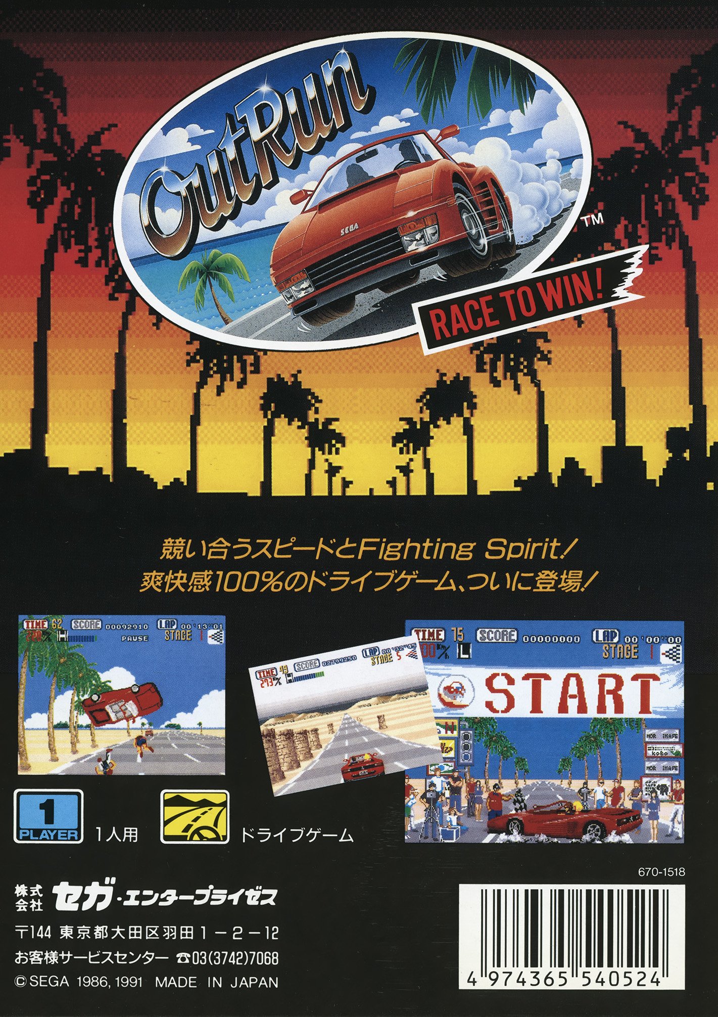
Out Run. Japanese back cover.
Don’t mention the war
You could write a whole book about the evolution of the video game industry in the 90s (and the regional variations and idiosyncrasies that characterised it). But for our purposes all we need to understand is that the industry’s centre of gravity was Japan. America was an obvious and huge secondary market… and Europe was a problem.
You don’t need a business degree to understand why Europe’s numerous languages, cultural differences, local regulations, and regional head offices caused a headache for Japanese console manufacturers.
So in order to meet regulatory requirements and spread the cost around, a compromised solution saw all Mega Drive games and associated packaging made available in eight languages and playable throughout the region.
There were exceptions, and premium products such as Phantasy Star 2 saw PAL specific UK / Australian variations. But for the most part European back covers are a non-starter when it comes to any discussion around design and aesthetic. So that leaves us with Japan and the US.
Whip Rush. Japanese back cover.
Salarymen vs School kids
As has been widely documented in countless articles and social media threads over the years, Japanese box art was almost always better than the US equivalents.
There are of course reasons for this.
In an article for Hardcore Gaming 101 Alex Carlson wrote that box art [and video game packaging] is “a way to see what marketers think we want, and it gives us an idea of how we judge movies and games subliminally.”
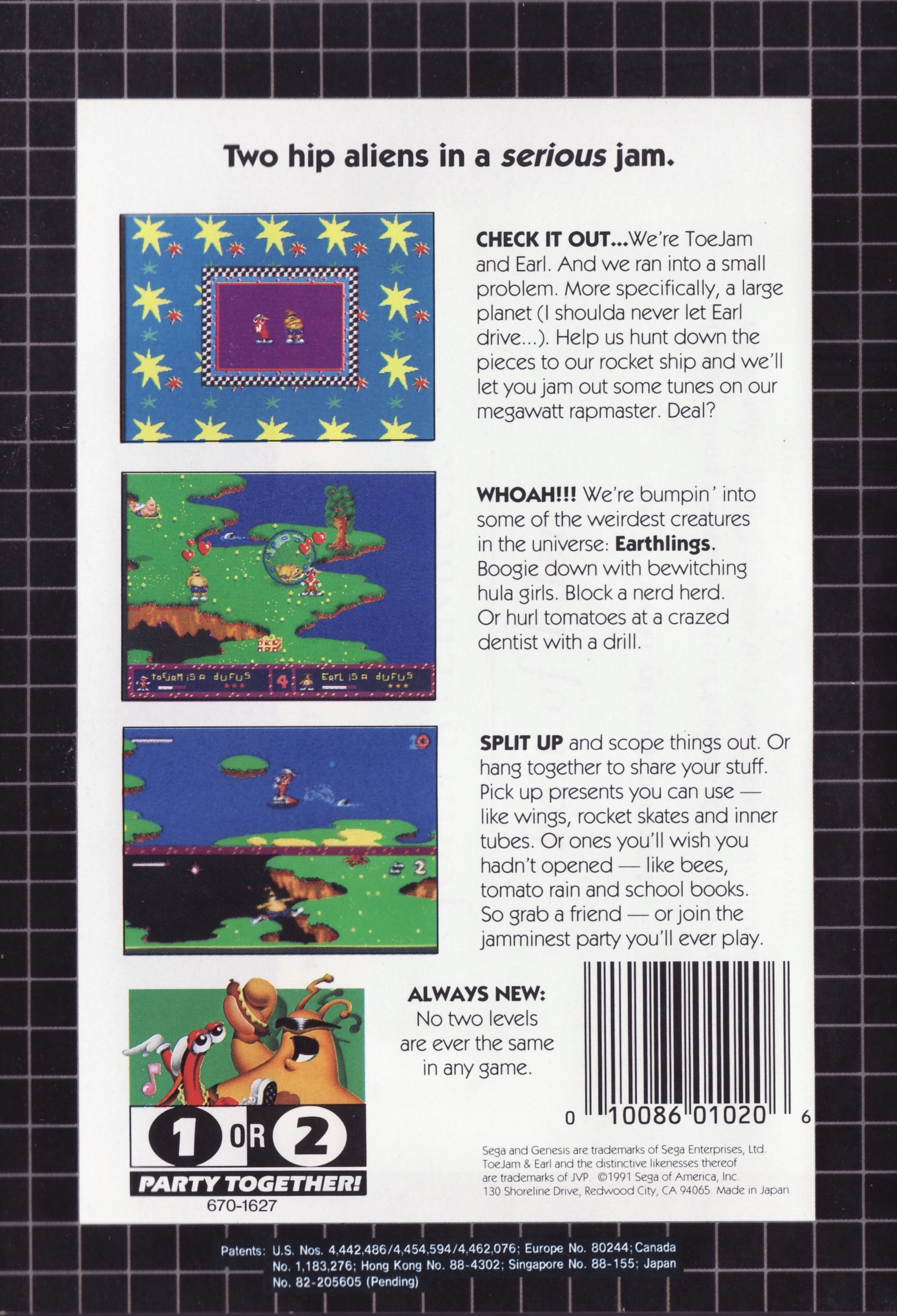
And there’s the rub. While both the US and Japan have a rich history of graphic design, the US video game market largely failed to tap into that history or skill set. Because as far as the market was concerned video games were for kids. And 12 year olds aren’t known for their discerning eye for graphic design.
The US packaging and designs reflect this. It’s bold, it’s bright, but it’s not particularly sophisticated. Because it doesn’t need to be.
Compare this with Japan, where video games sold to a much broader demographic and were positioned alongside traditional media such as film and music. In Japan, titles like Dragon Quest were just as likely to be played by kids as salarymen.
In other words, they were a mainstream product, intended for a broad audience. As such, the packaging and design was afforded the same consideration you’d see on film posters, print media, or album sleeves.
Point being, Japan invested in the aesthetic design and packaging of their games more than their western counterparts. They were also less strict about templates….
Golden Axe. US back cover.
Golden Axe. Japanese back cover.
A visual prompt
While US and PAL packaging followed rigid templates, especially when it came to the back-of-the-box, Japanese designs don’t appear to have the same constraints.
Did that creative freedom impact the designs? The Phantasy Star series offers up some clues.
The Japanese back cover for PS4 is almost entirely visual. The imagery evokes a mood and feeling about the game, its scope, and its ambitions using sci-fi anime imagery that wouldn’t look out of place on a 1970s album cover.
In contrast, the US version falls back on bullet-points, and very literally tells you what you’re getting. It’s a very traditional, powerpoint-like approach. And not in a good way.
As for the PAL European version, the best thing I can say is the screenshots have a nice visual consistently which helps you ignore all that German / Spanish / Italian text.
Phantasy Star IV. Japanese back cover.
Phantasy Star IV. US back cover.
Confusion
So far so good… But the problem with the above analysis is that it tends to fall apart under scrutiny.
We can make generalisations about video game box art and packaging based on region, but it only holds true for so long. Why? Because the video game industry of the 90s was still a wildly disjointed mess.
Contra was Probotector in Europe. Teenage Mutant Ninja Turtles were ‘Hero Turtles’ in the UK. Manufacturers like Sega and Nintendo couldn’t settle on a global name for their products, so the odds of any international packaging standard or visual cohesion was always going to be a stretch.
To Quote William Goldman’s infamous memoir, “Nobody knows anything.” That was true when he wrote it in reference to the film industry in 1983. It’s true now. And it was certainly true in the early 90s as the video game industry began to take on a more homogenised, global identity.
When it came to video game box art and the associated back covers, no one really knew anything. They were just making it up as they went along. It was chaos and guess work. It was budgets and time constraints. It was clueless management and frustrated marketers.
But periods of great chaos and uncertainty are when history gets interesting. And these back covers are an unsung part of that long road from binary code punch cards to a future still on the horizon.
Forgotten Worlds indeed.
….
Follow-us on Twitter via @American80s
Forgotten Worlds is a magazine-about-old-video-game-magazines. Issues 4 and 5 are currently in the works.
Rolling Thunder 2. Japanese back cover.
ToeJam and Earl. US back cover.
Valis 3. Japanese back cover.


